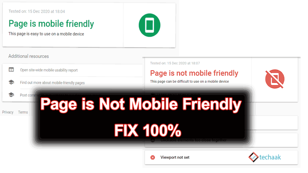
When you perform a mobile-friendly test on your web page, it shows “your page is mobile-friendly”. But when you validate affected URLs in Google Search Console, It ends with a result as “your page is not mobile-friendly“.
So the problem here is that the webpage passes the mobile-friendly test when you manually check but displays an error in the Google Search Console Tool. This article will explain all possible reasons why the page isn’t usable on mobile and how to fix the issue.
Initially, I got the same error on this website for mobile pages. I checked many solutions available on the internet to tackle this issue, and according to all of them, the current Google mobile testing tool is not working properly. However, I found that the tool is working as expected, and its result has no error. Let’s understand why a page is not mobile-friendly and how to fix it.
What are mobile-friendly web pages?
A web page is mobile-friendly when it satisfies the following requirements.
- The content fits within the mobile width – this is the main reason for the GSC mobile-friendly issue.
- The text size is large enough to read,
- Clickable items are large enough to click.
The web pages that fit with the mobile screens, correctly readable text size, and clickable elements are large enough to click. The content adjusts according to the screen width. So that mobile users can view a page in its initial view.
Google search console can display a mobile-friendly web page error even if a single line crosses the maximum screen width. This happens because the stylesheet CSS or function JavaScript file is not loading as expected. There may be a few other reasons; these are:-
- Missing maximum screen with tag,
- robots.txt file blocking the resources,
- Issues with the AMP page,
- Using 3rd partly overflow widget.
Importance of Mobile-Friendly Web Pages
In today’s digital age, the majority of internet users access the web through their mobile devices. This makes it crucial for businesses and website owners to ensure their web pages are mobile-friendly. Not only does this improve the user experience, but it also impacts search engine rankings.
Google, for instance, prioritizes mobile-friendly websites in its search results. Therefore, having a mobile-friendly website can significantly boost your online visibility and SEO.
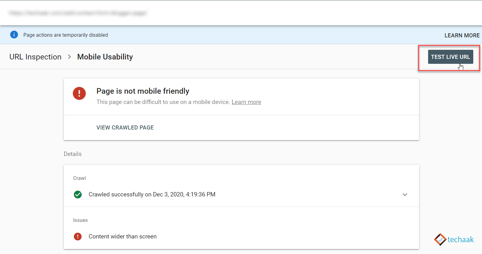
Page is NOT mobile-friendly – mobile usability test.
This error occurs when you check your webpage for mobile friendliness. The possible reasons for this may be.
- Your page may not use a mobile-friendly theme.
- Your content is wider than the screen.
To resolve these issues, you can use the following:-
Sure, here are the solutions you mentioned, rewritten as bullet points:
- Use a Mobile-Friendly Theme: If your page is not using a mobile-friendly theme, this could be the cause of the issue. Switch to a theme designed to be responsive and compatible with mobile devices.
- Review Specific Page Content Where Error is Thrown: If your content is wider than the screen, it can cause mobile-friendliness issues. Review the specific pages where the error is thrown by visiting the site from your mobile device. Check whether the content is wider than the screen or not.
- Check for Pop-Up Windows: If you’re using pop-up windows, ensure they are responsive. If the pop-up window you’re using is of fixed size for both mobile and desktop versions, your page may not be responsive due to that pop-up. Consider using a responsive pop-up design or disabling pop-ups for mobile versions of your site.
- Ensure the Viewport Meta Tag is Present: The viewport meta tag is crucial for responsive design. If it’s missing, this could be the cause of the issue. Implement the following code in between the
<head>and</head>section of your HTML:<meta content='width=device-width, initial-scale=1, minimum-scale=1' name='viewport'/>
By addressing these points, you may be able to resolve the mobile-friendliness issues on your webpage. But if not, follow this guide.
The robots.txt file blocks resources.
This error occurs when your page is mobile-friendly but not for Google Mobile-first Bots. And may result in a low position in SERP. You may see a decline in organic traffic to your website, especially mobile phone users.
This is all due to the robots.txt file of your website. The function of the robots.txt file is to control the web crawlers/Bots to allow or disallow the section and provide the sitemap path. Suppose the current robots.txt file blocks the web crawler from accessing the page resources like JS or CSS files. These elements are responsible for a responsive website, and robots.txt prevents these resources, making the page not mobile-friendly.
How do we fix the robots.txt issue?
For this, you’ve to make changes in the robots.txt file of your website or blog. In WordPress, the robots.txt file may not allow the crawler to crawl JS, CSS, or even the wp-content section. If you recently changed WordPress’s default robots.txt file, please revert all the changes. You can also apply the default robots.txt file.
The default robots.txt file for the WordPress
User-agent: *
Disallow: /wp-admin/
Allow: /wp-admin/admin-ajax.php
Allow: /

Sitemap: https://example.com/sitemap_index.xml
After changing the robots.txt file, please validate the mobile-friendly page error. Then, you’ll get a message of a successful operation.
In the above robots.txt file, you allow the crawler to visit all the sections of the blog or website. That may cause duplicate content issues. To avoid this and boost the SEO of WordPress, install and set up Yoast SEO Plugin or Rank Math SEO plugin.
Mobile-Friendly in the usability test, but NOT after validation.
If this is the case, when you check your page for Mobile-Friendly Test, the results show Your Page is mobile-friendly. But when you submit the page for validation in the Google Search Console, you receive an email stating that the problem is not solved after validation.

Now, first, we’ve to understand the problem. Which section is wider than the screen after the validation result? Does your webpage support AMP? Then, you’ve to check whether your AMP page has issues.
This means your website is responsible for mobile, but the AMP version is not.
Perform Mobile-Friendly Test for Google
In the above case, you have to test the URL directly in Google Search Console instead of using the Mobile-Friendly Test. To do this, perform a live site test to demonstrate the final result. You can try it by disabling the AMP page and enabling the AMP pages.
When you perform the above test for mobile usability in Google Search Console, it will give you the final result you may expect. Suppose you got errors with the AMP-enabled page and no error after disabling AMP. In such a case, try changing the CSS for the object, causing the AMP version’s errors or disabling the AMP for the particular page.
The Page resource couldn’t be loaded, and other errors.
If the above two methods fail, page resources could be the reason. The website breaks the connection for Google bots.
In such a case, contact your hosting provider to increase the connection time out or request a time of at least 120 seconds for your website. That means the connection can stay 120 seconds, at least for a session, to load all resources.
Conclusion
In this tutorial guide, we understood all the causes of the mobile-friendly issue of your website. The methods we discussed are:- page is loading pop-ups that are not mobile-friendly, resources are blocked by robots.txt file, AMP issue, and server timeout error.
I hope this article helps you fix the mobile-friendly error for Google Search Console. In case of any doubt, feel free to ask in the comment section below. Thank you.
thank you so much, could you please help me to fix my site issue
I have read your full Blog. Your blog is Great. Can you fix my website issue, please? Four issues were detected by the google search console regarding mobile usability on my website. I am unable to correct the issue on my website.
1. Text Too small
2. Clickable Elements too Close together
3. Content wider than screen
4. Viewport not set
Please help me.
Please
Sania. This worked for me on number 4. Viewport not set:
Add this line anywhere in the head of your page:
Thanks. I’ve just allowed some directories on robots txt. I hope this will fix the issue.
Hello Sir
By web site not crawling Can you suggest
https://www.outsourcebimservicesindia.com/
Please Chek MyWeb Site SEO –
1. https://examresultjob.com/
2. https://news360view.com/
3. https://sarkarialerts.in/
Thanks for your info my site have same issues.
You are awesome. I applied the first solution of meta tag between the head tag and instantly the problem got solved. now the webpage is mobile friendly on Google console. Thanks a ton. Very useful indeed.
Many many thanks tis code has fixed my issue. I was searching for the solution for about two months finally got this. thanks God bless you.
thanks for you
and you answered me one question
some pages in an error the mobile availability
So could you suggest any tips for solving this issue?!!
Please Chek MyWeb Site SEO –
1. https://examresultjob.com/
2. https://news360view.com/
3. https://sarkarialerts.in/